Mar 29, 2024
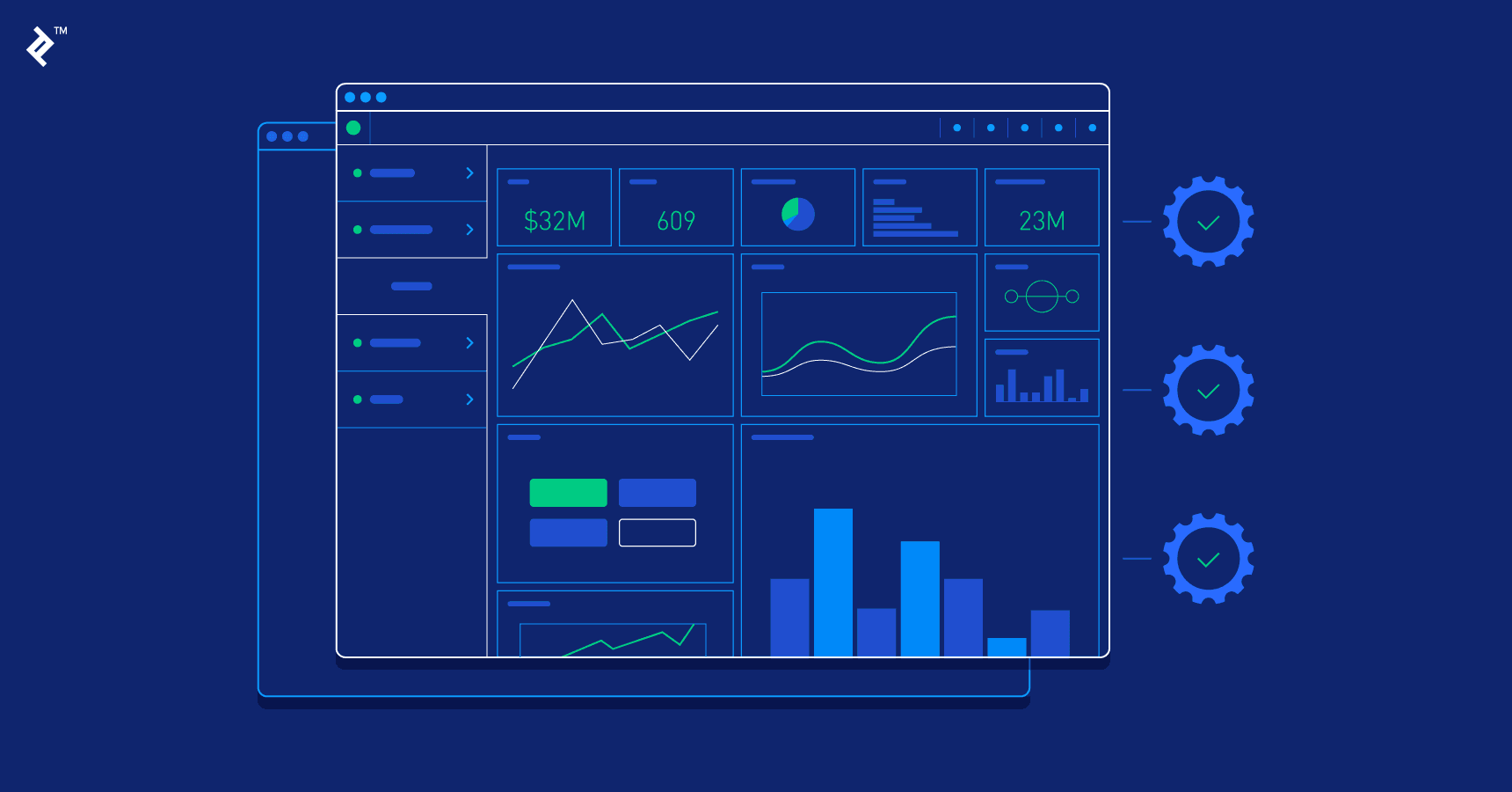
Dashboards represent a unique and potent means of conveying data-driven insights through visualizations, encapsulating relevant information and key performance indicators (KPIs) in a format that facilitates quick comprehension and action. Originating from the traditional automobile dashboard, they have seamlessly transitioned into the digital realm, serving a similar function of providing immediate access to essential information.
Stephen Few, in his book on information dashboard design, succinctly defines a dashboard as "a visual display of the most important information needed to achieve one or more objectives; consolidated and arranged on a single screen so the information can be monitored at a glance." This definition underscores the essence of dashboards: to offer a concise overview that enables rapid decision-making.
To effectively design dashboards, it's imperative to adopt the right approach to data visualization. Data visualization entails presenting data through graphics and images, with the primary goal of aiding decision-makers in identifying patterns or grasping complex concepts that might be challenging to discern through textual formats alone.
As Noah Iliinsky and Julie Steele emphasize in their book on data visualization, the designer's ultimate objective is to create a deliverable that is not only well-received but also easily understood by the audience. Every design choice and implementation must serve this purpose, ensuring that the dashboard effectively communicates the intended information and facilitates informed decision-making.
By leveraging strategic, analytical, operational, and informational examples, coupled with fundamental design principles, dashboards can serve as indispensable tools for navigating the data landscape and driving organizational success.
Key Characteristics of Great Dashboards
Effective dashboards serve as a conduit for actionable insights, simplifying the comprehension of complex data and facilitating stakeholders' ability to understand, analyze, and present key information.
A superior dashboard possesses several characteristics:
- Rapid Communication: It swiftly communicates pertinent information.
- Clarity and Efficiency: Information is presented clearly and efficiently.
- Temporal Insights: Trends and data changes over time are readily apparent.
- Customizability: Users can tailor the dashboard to their specific needs.
- Space Optimization: Crucial widgets and data components are effectively showcased within a limited space.
Initial customization based on user requirements enhances usability and eliminates the necessity for various user personas.
Furthermore, exceptional dashboards ensure that all vital information is a single click away:
- Immediate Accessibility: Essential information is readily accessible.
- Data Prioritization: Data is presented in a prioritized manner.
- Visual Hierarchy: Information is arranged hierarchically on a single screen for coherent overview, with opportunities for deeper exploration.
- Minimized Views with Expandability: Elements are initially displayed in a condensed format, with options to access more detailed information through modal windows or dedicated pages.
- Enhanced Usability with Filters: Users can customize data display and filter content using labels, categories, and KPIs, thus improving usability.
In essence, a well-designed dashboard streamlines data interpretation and decision-making processes by presenting pertinent information clearly, prioritizing accessibility, and allowing for user customization.
Reduced Complexity Provides Clarity
In an era inundated with data, clarity in information presentation stands as a formidable challenge. Dashboards play a pivotal role by distilling only the most pertinent data—a crucial endeavor, as the abundance of information can obscure rather than illuminate.
When confronted with an abundance of data options, designers must curate a focused subset, prioritizing relevance while meticulously removing misleading or ambiguous metrics.
Effective dashboard design hinges on several key considerations:
1. Alignment with Project Goals: Design choices should align closely with the overarching objectives of the project.
2. Understanding the Data: Deep comprehension of the data's nature is essential for making informed design decisions.
3. User Needs: Tailoring the dashboard to meet the specific needs of users ensures relevance and usability.
In any communication, including visualizations, the audience's cognitive resources are limited. Therefore, the dashboard must strike a delicate balance, allocating minimal cognitive load to decoding the visualization and maximizing comprehension of the message.
The fundamental aim of a dashboard is to render complex information accessible and easily digestible. Consequently, the interface must be sleek and intuitive, minimizing users' cognitive burden and search time.
Information architecture should prioritize essential data while offering access to supplementary or secondary metrics. A progressive drill-down system, starting from a general overview and delving into more granular details, facilitates data prioritization and fosters clarity. This approach ensures that users can swiftly grasp key insights while retaining the option to explore additional layers of information as needed.
Determining Dashboard Goals and Displaying Appropriate Data
In the realm of dashboard design, successful designers embark on their journey armed with a clear set of objectives, meticulously honing in on the problems to be solved and the actionable insights users seek within the data.
Effective design goals serve as catalysts for efficient and precise execution. Leveraging the S.M.A.R.T framework (specific, measurable, actionable, realistic, and time-based) for goal setting ensures that objectives are well-defined and attainable.
Key questions guide the determination of dashboard design goals:
- User Journey Complexity: Assess the number of steps users must undertake to accomplish specific goals.
- Interface Intuitiveness: Evaluate the intuitiveness of the interface, gauging whether users can navigate towards their objectives independently.
- Requisite Information: Determine the essential information users require to successfully achieve their goals.
To ascertain the purpose of a particular dashboard design, it's crucial to inquire, "What specific problem does this design aim to solve for the user?" This inquiry unveils insights into the critical metrics, attributes, values, visuals, and data that hold significance.
Goal-centric design orbits around tangible solutions to genuine problems, laying the bedrock for exemplary dashboard design. Commence with a clear grasp of business objectives, factor in user goals, and subsequently communicate the indispensable information. This iterative approach ensures that the dashboard serves as an effective tool for decision-making and problem-solving, resonating with both users' needs and organizational objectives.
Context in Dashboard Design
Dashboard design encounters a significant challenge in catering to multiple user personas. Once each user role is delineated, it becomes imperative to discern the points of convergence and divergence in their needs.
Effective communication serves as the bedrock of successful dashboard design. Anticipating potential user scenarios enhances understanding of their circumstances, enabling tailored design solutions.
Maintaining cognizance of users' contexts is paramount. This entails understanding their technical acumen, familiarity with the system, and overarching goals.
When seeking to unravel user behavior and context, consider the following questions:
- Reading Direction Consideration: Does the design accommodate the direction in which users are accustomed to reading?
- Technical Proficiency Requirement: Is technical knowledge requisite for interacting with the dashboard?
- Ease of Action Execution: Can users accomplish most actions within a few clicks?
- Alignment with User Context: Does the design incorporate drill-down menus, suggestive iconography, and color palettes that align with user context?
Furthermore, the color palette employed in dashboard design holds contextual significance. For instance, many business-to-business SaaS product dashboards feature dark-themed UIs, catering to prolonged usage durations.
In essence, successful dashboard design hinges on a thorough understanding of users' contexts and behaviors, with tailored solutions crafted to address their diverse needs effectively. By considering factors such as reading direction, technical proficiency, ease of action execution, and color palette selection, designers can create dashboards that resonate deeply with users across various personas.
Enhancing Dashboard Design through User Research
User research is pivotal in crafting dashboards that offer relevant, clear, and concise data, enabling users to focus on content rather than navigation. Understanding users' goals, mental models, contexts, and pain points informs the dashboard's final design.
Mike Kuniavsky, a renowned user experience designer, emphasizes that user research is about understanding design's impact on the audience. Designers must delineate user types, identify shared goals, and discern divergent needs. They should determine which information is most actionable for each user type and consider if different layouts are necessary.
Starting with wireframes and progressing to prototypes tested with actual users streamlines the design process. Insights gleaned from even a short user research phase with five users can save significant time in the long run.
Utilizing Progressive Disclosure in Dashboard Design
Progressive disclosure streamlines user attention by minimizing clutter, prioritizing features, and reducing error rates. This technique allows users to focus on pertinent information, enhancing efficiency and understanding.
By deferring advanced or infrequently used features to secondary screens, progressive disclosure facilitates easier learning and reduces errors. Animation serves as a dynamic feedback mechanism, alleviating user uncertainty and enhancing perceived performance, especially during data loading.
Advantages of progressive disclosure include reducing user anxiety, providing clear expectations, and engaging users during data retrieval. However, inappropriate use of indicators or static progress indicators can lead to distractions and uncertainty.
Summary
Dashboards are potent communication tools when designed with a user-centered, goal-centric approach, following best practices in dashboard design and data visualization. Key principles include empathizing with user types, conveying a clear narrative through visuals and progressive disclosure, simplifying complexity through user research, revealing information progressively, and using data visualization effectively.
By adhering to these principles and observing them in exemplar dashboard layouts, designers can create exceptional designs tailored to diverse user needs and goals.
